
Organize Projects Visually with Multi-Select Fields and Color-Coded Timelines
Timetoast now includes multi-select fields and color-coded grouping, making it easier to organize complex projects and visualize timelines at a glance.

Two long-awaited features are here in Timetoast Unbound: multi-select fields and color-coded grouping. Together, they make complex projects easier to organize and understand at a glance.
These updates aren’t just new features; they redefine how you organize and visualize your projects, giving you more flexibility and control over how your timelines look and work
Multi-Select Fields: Smarter Categorization
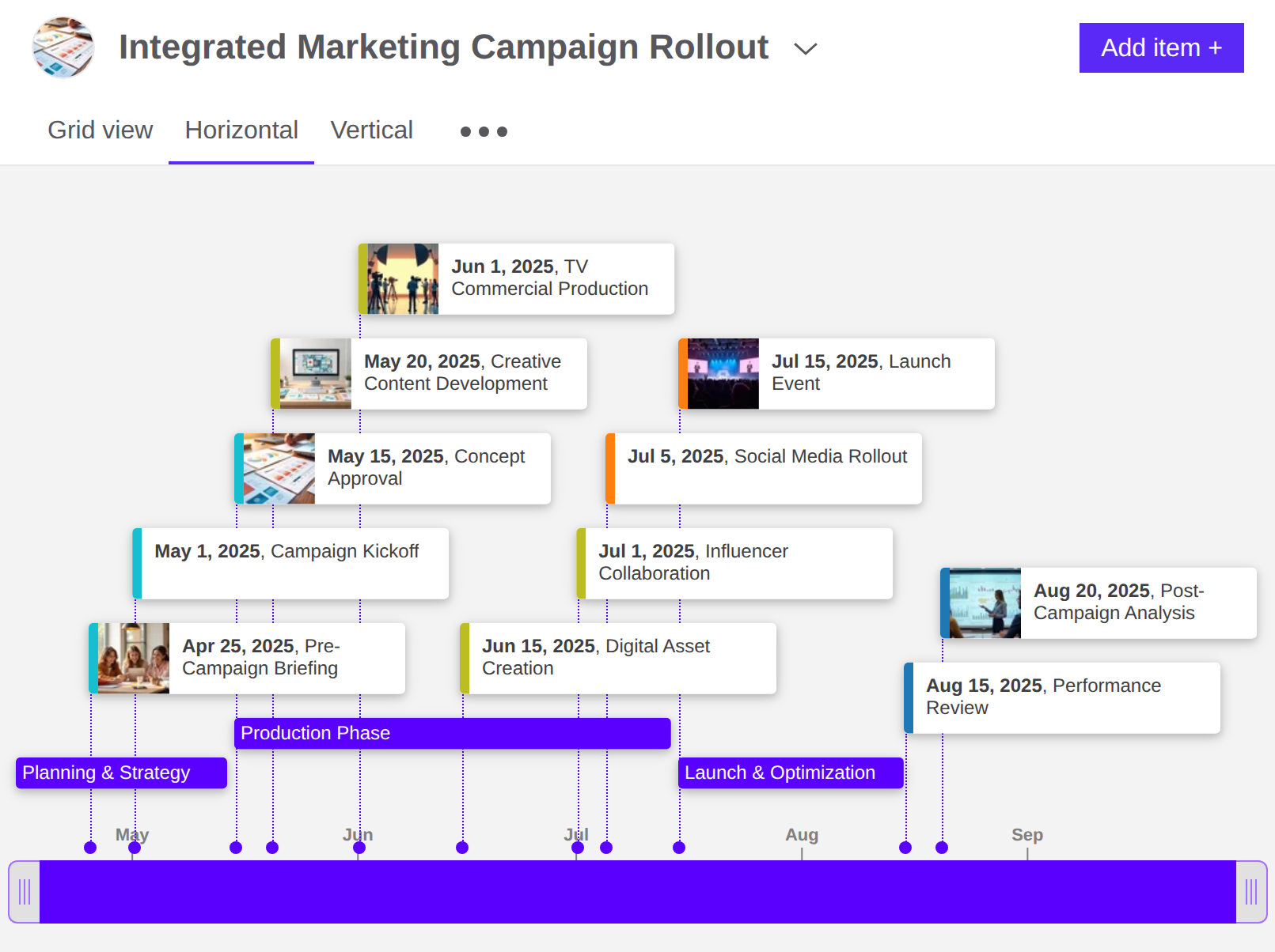
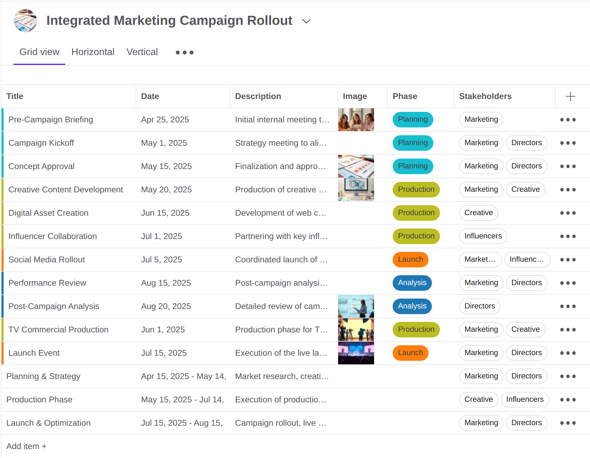
Projects rarely fit into a single box. Our new multi-select fields let you assign more than one option from a dropdown, so a single timeline item can carry multiple values as shown below.
- Tag a milestone with more than one department (“Design + Engineering”).
- Track priorities that cut across themes (“Urgent + Client A”).
- Categorize an event with more than one theme (“Politics + Culture”).
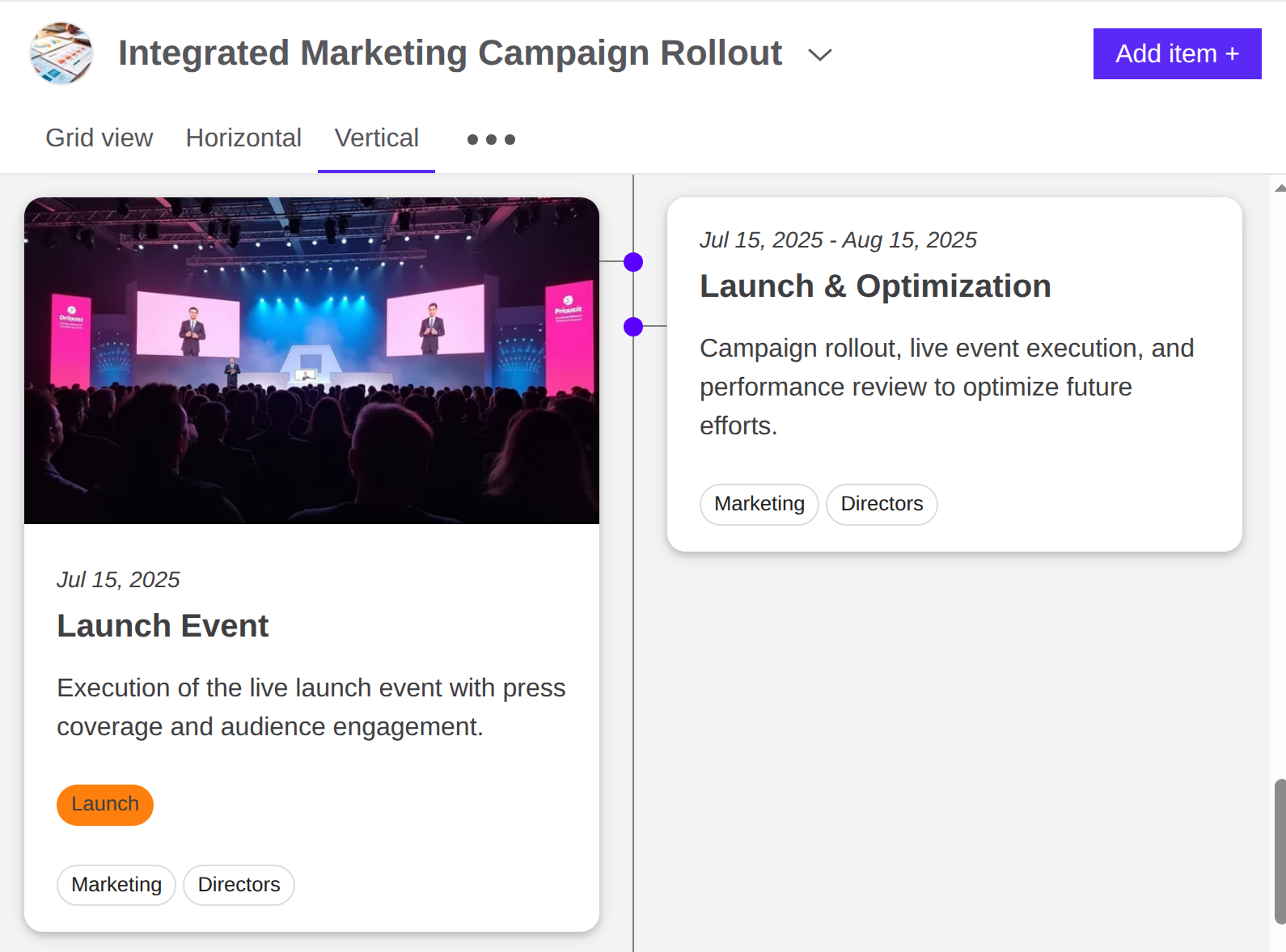
In the grid view, values appear as clean, chip-style labels that make categories easy to scan with the primary value's color also displayed at the start of each row. In horizontal timeline view, the primary value shows as a colored bar alongside the event, while timespans take on that color across their duration. Expanded items are similar to the vertical view, with color-coding providing a quick and easy way to tell them apart.
Color-Coded Grouping: Visual Signals at a Glance
Colors make patterns pop. With color-coded grouping, you can define simple rules based on field values and apply them across your entire project.
- Give each team its own color.
- Highlight urgent or delayed items automatically.
- Use color to distinguish clients, work-streams, or regions.
- For historical timelines, quickly group events by empire, dynasty, or era—for example, separating Roman and Greek milestones at a glance.
Once set, your colors stay consistent across every view, so categories remain instantly recognizable without extra work.
Stronger Together
Multi-select fields capture the richness of your data, while color-coding turns that data into clear visual cues. Together, they make projects easier to understand at a glance.
Since this update, we’ve also added single-select fields for clear statuses and phases. If you want each item to have one main state, you can read more in our post, Track Project Status with New Single-Select Fields.
Start using Multi-Select Fields and Color-Coded Grouping in your Timetoast Unbound projects today.
Timetoast Unbound is currently available in Beta for paying users, and we’re rolling out new features regularly. Your feedback helps shape what comes next. Explore how Timetoast helps teams plan and manage projects visually on our Project Management page.