More on our new visual identity

When we first set out to create a new identity for Timetoast, we endeavoured to unify the core values of the service in a recognisable and timeless new brand identity; one that communicates the different facets of the service as well as its community.
We asked Silvia Giulianini to help create this new identity, so I want to let her explain the ideas behind it:
Timetoast's new identity is a conceptual representation of the core brand idea of being a collection of different stories shared within its community. It reflects the positioning of the brand as friendly, democratic and inspiring.
The visual language used to convey the intangibility of time is abstract and it aims to express the notion of a timeline as a way of displaying a list of events in chronological order.
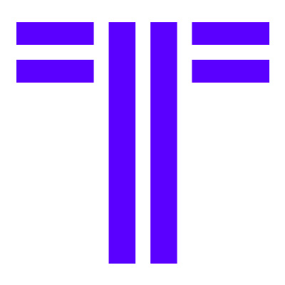
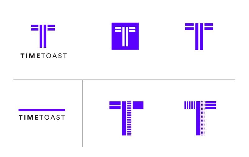
At the heart of the identity is a new logo: the monogram ‘T’ which is simple and serves as a good device for the social-media-driven world, fitting perfectly in a square.
Several versions of the logo have been created to be used across different applications, in order to reinforce the idea of community: the combination of different modular lines that make the mark T are an expression of Timetoast’s collection of different timelines.
The type chosen is the geometric Sans Serif called Circular. It pairs well with the modularity of the identity and the new bright colours are an evolution of the previous identity, with added vibrancy.
The new visual identity is brought to life with the use of colourful photographic imagery. Held within the modular shapes this creates a flexible and bold identity.
I hope you'll agree that Silvia did a great job, I'm certainly very happy with what she created for us.