A bold new visual identity

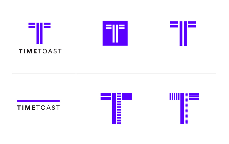
If you've visited Timetoast over the last couple of days, you have probably noticed that we've unveiled our new visual identity.

We're extremely happy to finally share this fresh direction with you; it has been many months in the making.
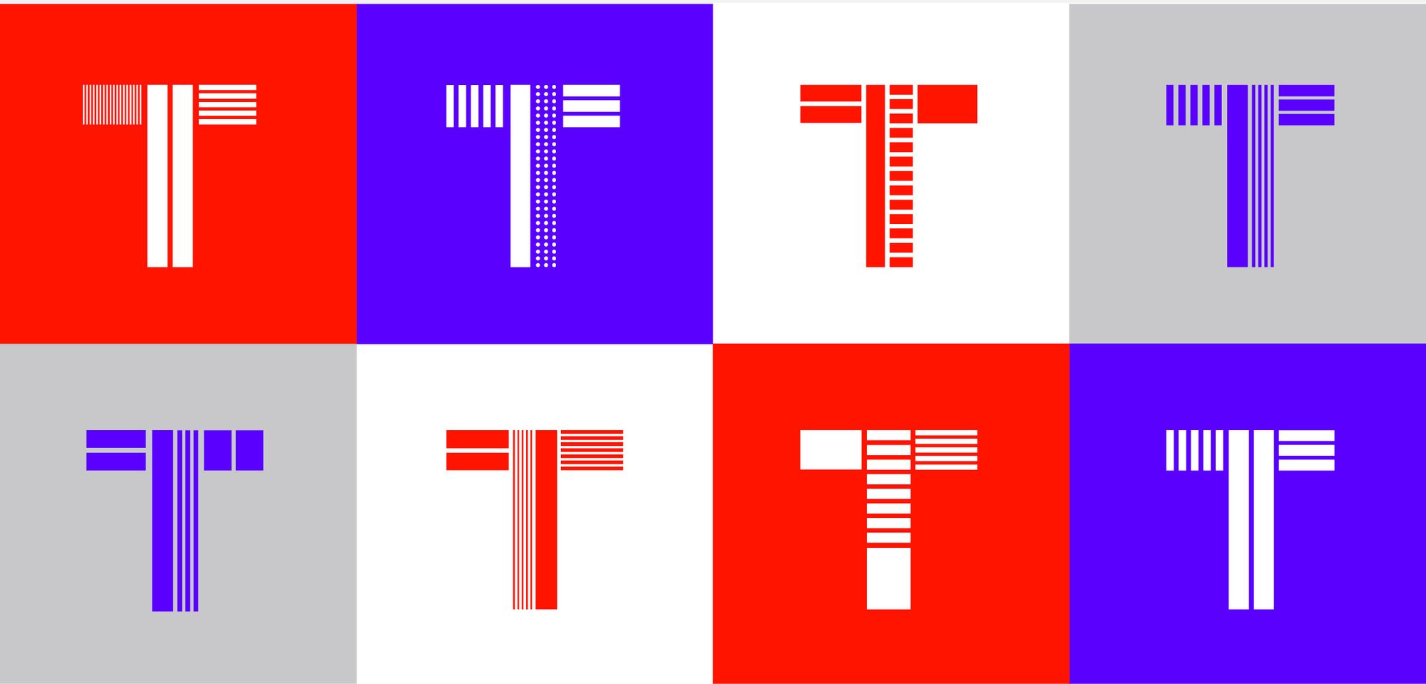
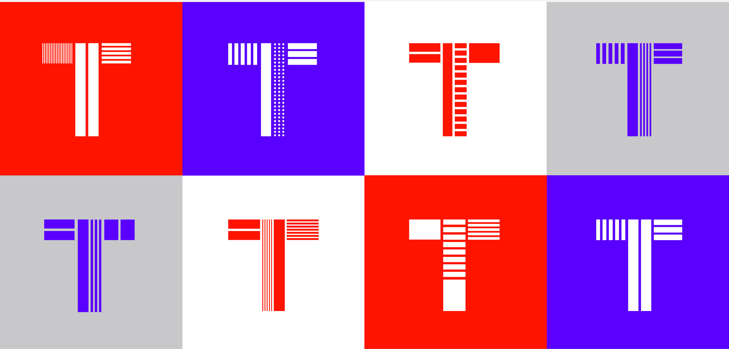
Not only is our identity now much cleaner, stronger and more focused, we believe its best quality is its versatility moving forward.
Geometric shapes, coupled with bold colors, provide a clear visual foundation on which to move forward.

To see our new identity in action, visit the Timetoast timelines site.

